
Overview
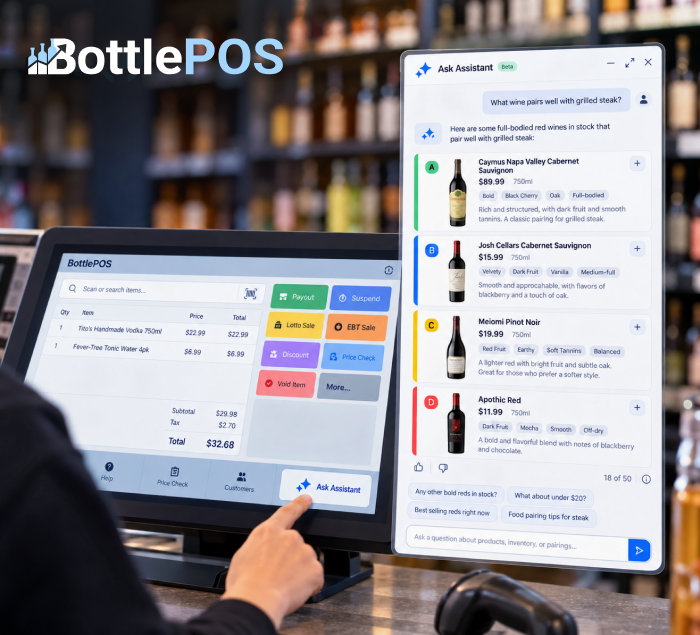
I designed an AI assistant that helps liquor store cashiers answer customer questions directly from the register, without leaving the sale screen. I took the experience from early wireframes to a working interactive prototype for the product and development team at Quilt Software.
A cashier can ask for a recommendation, a food or cocktail pairing, a price check, or a stock lookup. The assistant responds with concise answers and product cards showing information like price, size, inventory, and flavor tags, helping staff find useful answers while serving a customer.
The project reached the development stage before I left the company.
My role
I was the Sr. Product Designer on the project, from the first concept to a working prototype that I handed to the developers.
- Defined the conversation experience: welcome state, starter questions, answer format, follow-up suggestions, and feedback controls
- Designed the product card, including a color-coded edge that shows each product’s rank
- Decided how the assistant lives inside the register: a launcher button in the corner and a widget that users can resize to any size
- Built an interactive prototype so the dev team could see the behavior, not only static screens
- Researched competitor AI assistants and reviewed user testing session recordings
I worked with a product manager and an engineer.
The problem
Store staff wanted a handy AI assistant to check inventory quickly and to answer their customers’ questions.
The starter questions in my prototype show the moments I designed for. Customers ask what pairs with a dish or a drink, what is good under a set price, and what sells best. The cashier has to answer on the spot.
I researched competitor sites that offer AI assistants to their daily users. I also reviewed user testing session recordings and support tickets that my PM created.
Goals
The assistant had to give store staff a useful answer in a few seconds, inside a screen that was already busy.
- Keep the cashier on the sale screen while they look something up
- Make answers quick to scan, with price, size, and tags visible without reading a paragraph
- Recommend products the store can actually sell
- Let cashiers rate answers, so the team can learn what works
- Let users size the widget to fit how they work, not just small or large
Users and context
The main users are store staff at liquor and convenience stores, working at a register that is already crowded.
The BottlePOS register holds a cart table, shortcut keys, 13 colored function buttons (Payout, Suspend, Lotto Sale, EBT sale, and more), and alcohol and tobacco cutoff dates. The demo store I reviewed carries about 23,700 items. So a new feature had to add help without adding clutter, and it had to find the right product in a very large catalog.
Design process
I moved from research to a working prototype, so the team could experience the assistant before building it.
- Reviewed competitor products to understand common AI assistant patterns
- Watched user testing recordings to identify pain points, including the need to resize the assistant more freely
- Designed the register entry point, suggested questions, conversation experience, and product recommendations
- Built a hosted interactive prototype using sample responses, so the team could experience the flow and interaction behavior instead of reviewing static screens
- Reviewed and refined the experience with the product manager and engineer
- Handed off the final designs and prototype to engineering before I left the company
Key design decisions
6 decisions shaped the assistant, and users helped shape several of them.
1. A corner launcher and a side panel
The assistant opens from a button in the bottom corner as a side panel, so the sale screen stays in view and the cashier never leaves the cart. I also considered a pop-up in the center of the register. Users said it would be too annoying, because they did not want anything covering the POS interface, even briefly. So I chose the corner panel.
2. Drag a corner to resize the widget
Users can drag a corner of the widget to scale it to any size. The earlier version offered only two fixed sizes, small and large, and user testing recordings showed that people wanted more control. Staff can now fit the widget to their screen and their workflow.
3. Suggested questions on the home screen
The home screen of the widget shows suggested question cards, built from the most asked questions. Examples are “Top 5 selling rums in stock” and “Good cigars under $15.” They teach the range of the assistant in one glance and save typing. The questions came from support tickets that my PM created.
4. Product cards with a rank color
Product answers come back as cards with name, price or price range, tags, and a short description that expands with “View more.” A color on the left of each card shows the product’s rank: A (best) in green, B (good) in blue, C (average) in yellow, and D (lower) in red. A legend above the cards explains the colors. In my Figma designs, each card also shows quantity on hand and the aisle and shelf, so staff can find the bottle fast. Rank is based on each product’s sales.
5. Follow-up chips after each answer
In the prototype, each answer ends with suggested next questions, such as “Any cocktail bitters in stock?” They keep the conversation moving without typing.
6. Feedback on each answer
Thumbs up and down sit under each answer, so cashiers can flag bad answers.
My Figma designs add two more controls. A query limit counter, such as 18 of 50, shows how much a user has left. A Recent list gives quick access to past questions.
[video width=”2866″ height=”2160″
Design outcome
The project resulted in a development-ready experience that showed how an AI assistant could fit into an already complex POS workflow without taking the cashier away from the sale.
The final design established several core patterns:
- AI inside the existing workflow: Cashiers could get help without navigating away from the register.
- Flexible workspace: The assistant could be resized to fit different screen setups and working styles.
- Guided discovery: Suggested questions helped users understand what they could ask without needing to learn how to prompt an AI.
- Actionable recommendations: Product cards connected AI responses with real store information such as price, inventory, location, and sales ranking.
- Conversational follow-up: Suggested questions made it easier to refine a recommendation without starting over.
- Built-in feedback: Simple rating controls gave the product team a way to identify useful and poor responses over time.
Reflection
This project changed how I think about designing AI features. The challenge wasn’t simply adding a chat interface to the POS. It was deciding where AI could reduce friction in an existing workflow and how its answers should be structured for the person using it.
A cashier helping a customer doesn’t have time to read a long AI response. Recommendations needed to be fast to scan, connected to products the store actually carries, and useful enough to act on immediately.
User feedback also changed important interaction decisions. Testing recordings led me from fixed widget sizes to flexible resizing, while feedback on an early centered pop-up showed that even a useful AI feature could become disruptive if it competed with the cashier’s primary task.