
Overview
Role: Senior Product Designer
Team: 3 Product Designers, Frontend Engineers
Tools: Figma, Storybook
Animoto is an online video creation platform that helps businesses and individuals create professional videos without editing experience.
As one of 3 product designers on the team, I helped create and maintain Animoto’s design system to improve consistency across the product while making collaboration between design and engineering more efficient.
Working closely with front end engineers, we aligned the Figma component library with Storybook so designers and developers were building from the same source of truth.
The Challenge
As the product evolved over time, the interface became increasingly difficult to maintain.
Some of the biggest challenges included:
- Multiple versions of the same UI components
- Inconsistent button styles, spacing, and interactions
- Designers creating new component variations instead of reusing existing ones
- Engineering implementing similar components differently
- Branding inconsistencies across experiences
- A design library that became difficult to scale
These issues slowed both design and development while making the product feel less cohesive.
My Role
I partnered with 2 other product designers to evolve and maintain the design system across the product.
My responsibilities included:
- Auditing existing UI components
- Consolidating redundant components
- Building reusable Figma components
- Creating variants with Auto Layout
- Establishing naming conventions
- Creating design tokens and shared styles
- Defining responsive behaviors for desktop and mobile
- Improving accessibility across components
- Writing component documentation
- Partnering closely with frontend engineers to align Figma with Storybook
Design Principles
The design system was guided by 4 principles:
Consistency: Reduce visual inconsistencies by encouraging teams to reuse standardized components rather than creating new ones.
Scalability: Build flexible components using variants, Auto Layout, and shared properties so they could support future product features.
Reusability: Create components that worked across multiple products and screen sizes instead of solving individual design problems.
Design & Engineering Alignment: Making sure designers and engineers referenced the same components and behaviors through Storybook.
Creating a More Scalable Component Library
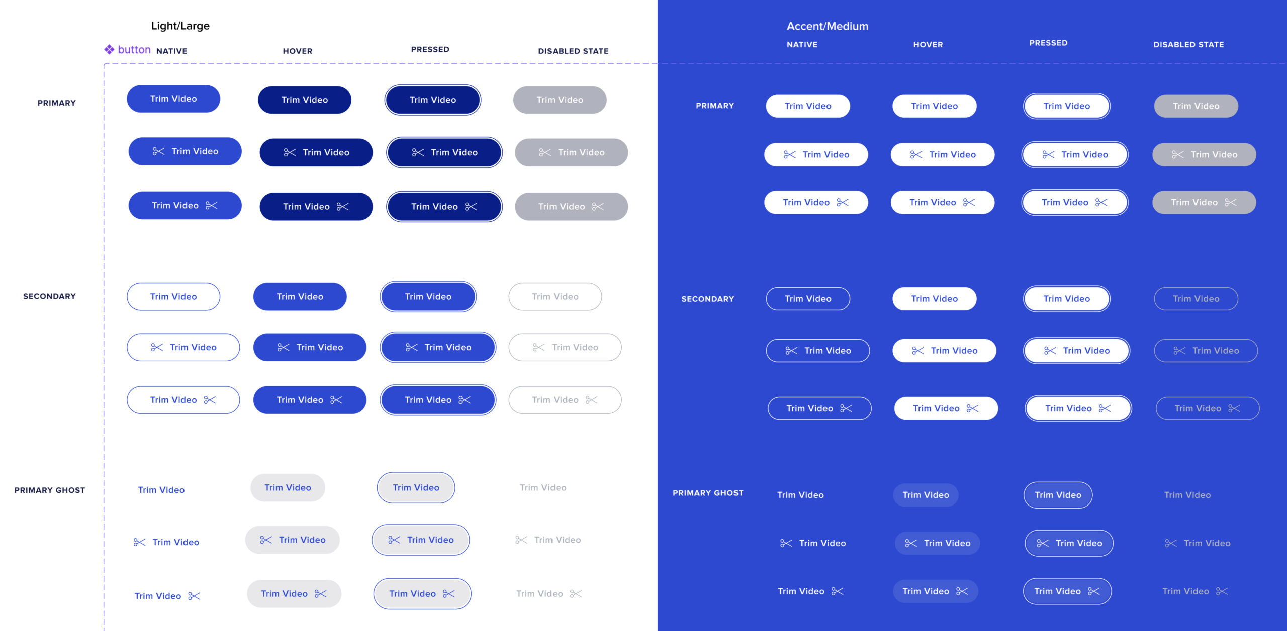
One of the largest efforts was auditing existing components and consolidating duplicate patterns.
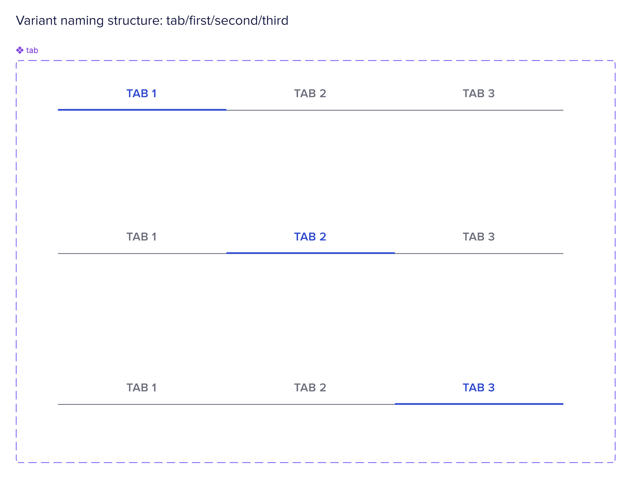
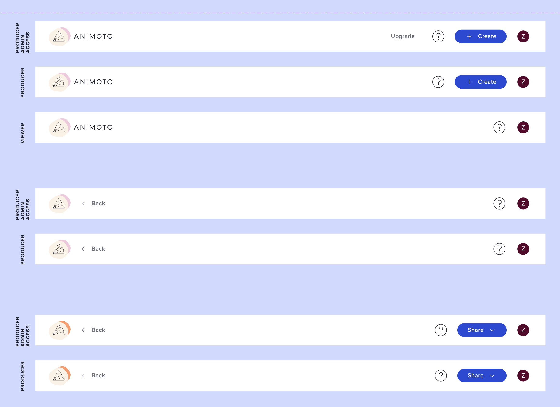
Instead of maintaining multiple versions of similar components, we standardized them into flexible components with variants.
Examples included:
- Buttons
- Tabs
- Toast notifications
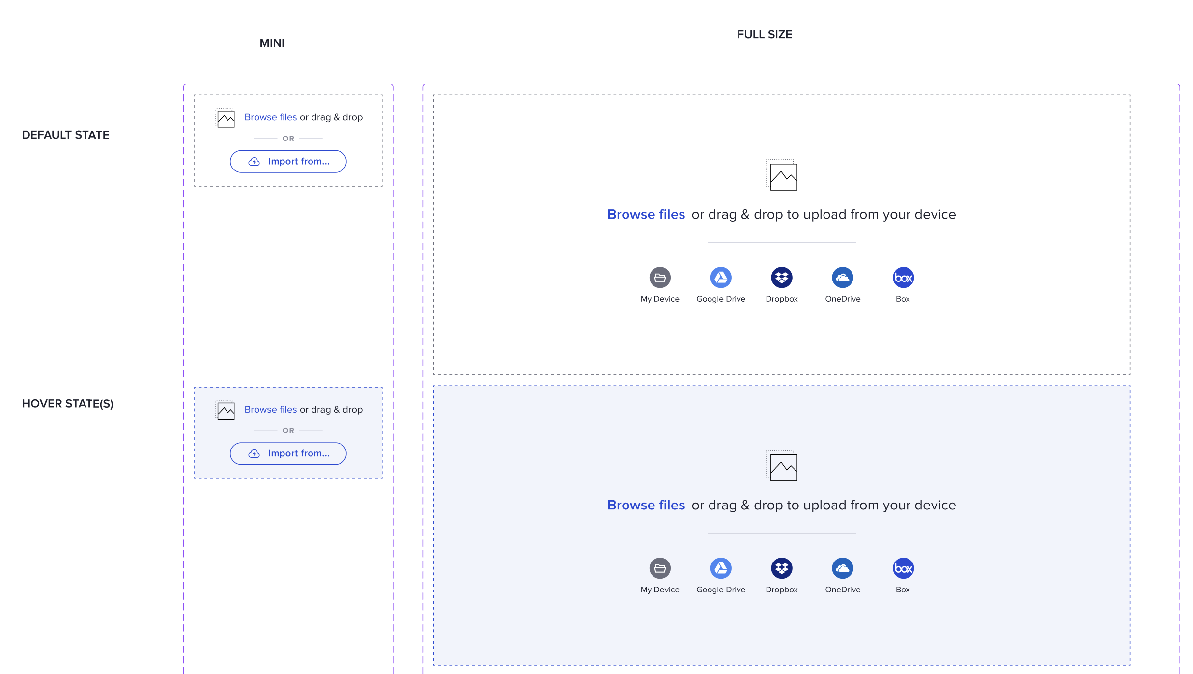
- Upload components
- Navigation
- Share permissions
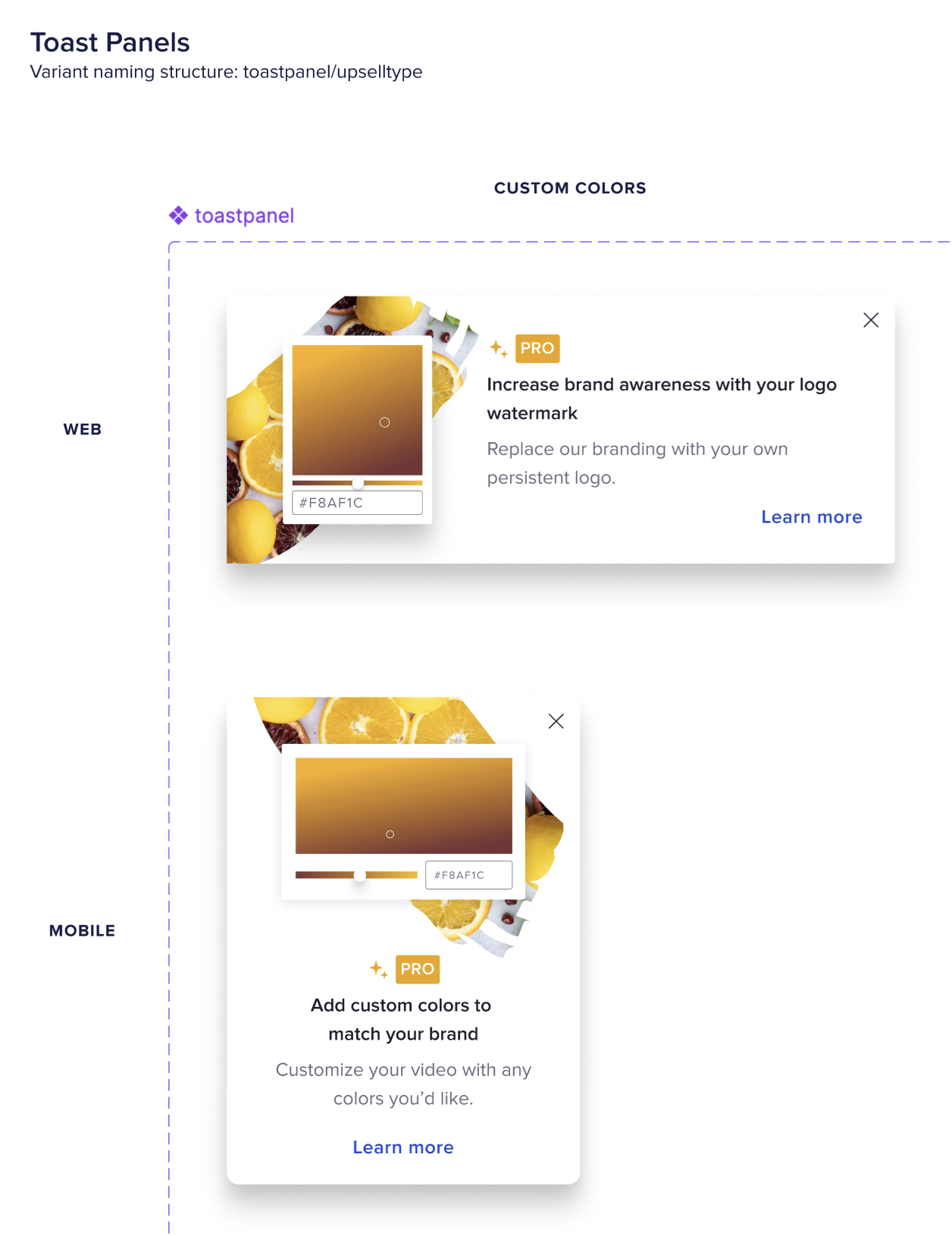
- Upsell cards
The result was a cleaner library that was easier for designers to browse and significantly reduced duplicate work.
Designing for Responsive Experiences
Many Animoto experiences needed to work across desktop and mobile.
Rather than creating separate components whenever possible, I built responsive variants that shared consistent behaviors while adapting to different layouts and interaction patterns.
Examples included:
- Upload components
- Upsell cards
- Navigation
- Permission dialogs
This reduced maintenance while improving consistency between platforms.
Improving Collaboration with Engineering
The design system wasn’t just a Figma library. I worked closely with front end engineers and made sure components were represented consistently in Storybook and reflected real implementation constraints.
This collaboration helped:
- improve component adoption
- establish shared naming conventions
- create a more reliable handoff process
Having a shared language between design and engineering made new feature development faster and more predictable.
Impact
The design system became the primary source of truth across the product.