
Overview
Role: Sr. Product Designer
Team: Collaborated with the development team
Problem: Before the system, Quilt was rebuilding buttons in every feature, shipping five shades of “brand blue,” working from mismatched design and code specs. Every new screen re-decided solved problems, and inconsistency compounded as the product and team grew. So we needed one source of truth designers and engineers could both build from.
The Approach
Choosing the right foundation was important. I evaluated with the dev team on Material UI, Chakra, Ant Design, building from scratch and chose the shadcn approach for a few reasons:
Ownership, not a dependency: Components live in our codebase, not a locked package; we will have full control over markup, styling, and behavior to carry Quilt’s brand.
Tailwind: A token-driven utility layer constrained spacing, color, and type to the system instead of improvising per screen.
A themeable token layer: shadcn’s CSS-variable architecture let me layer Quilt’s brand cleanly — one theme file drives the whole set.
Tradeoffs I accepted: copied components mean updates aren’t automatic, we owned a versioning story. Tailwind’s utilities have a learning curve.
Foundations
Design tokens
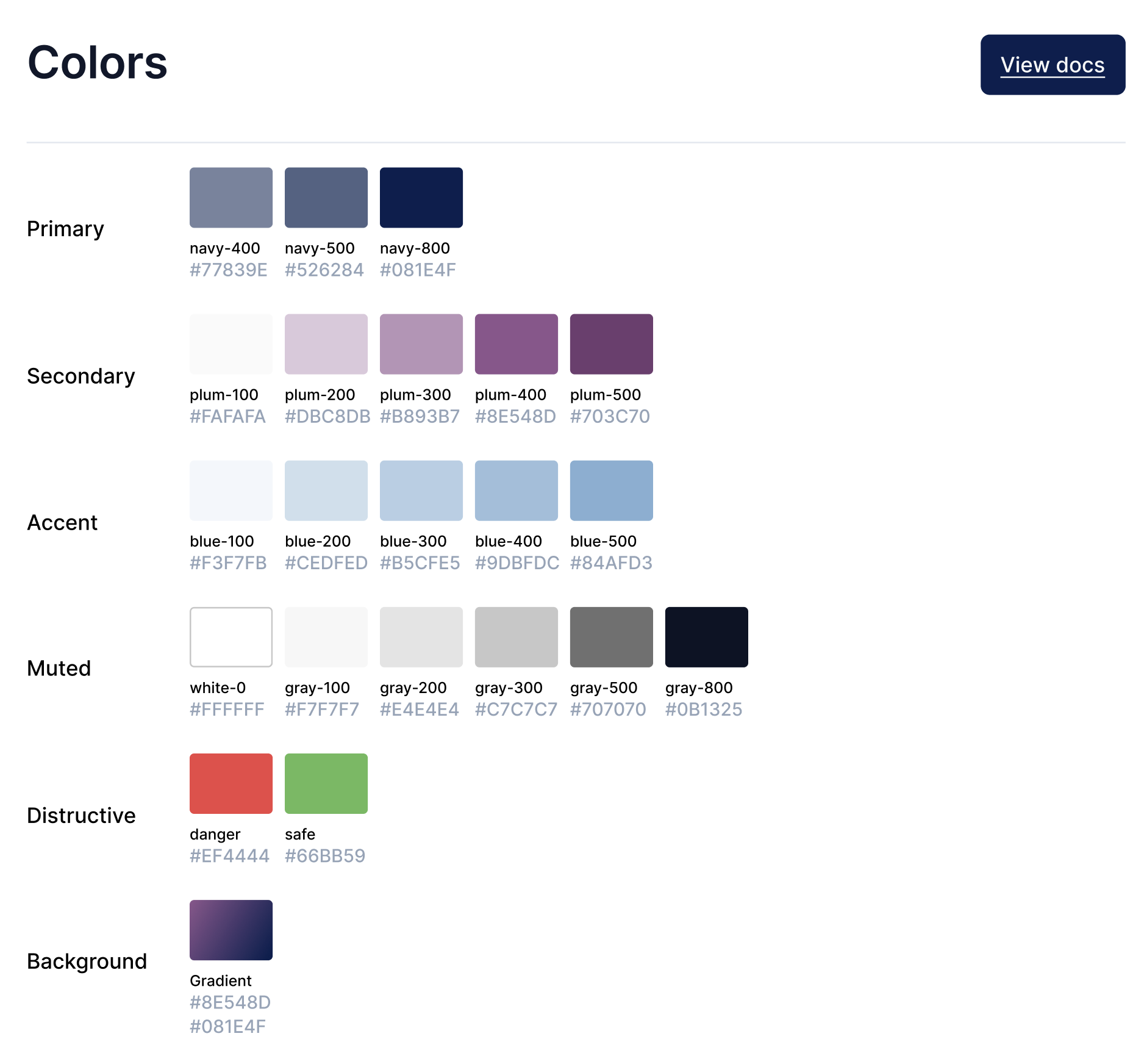
The heart of the system: CSS variables that define the whole visual language and make theming a one-file change. Toggle the theme in the top bar — every component below re-themes from these tokens.
Button
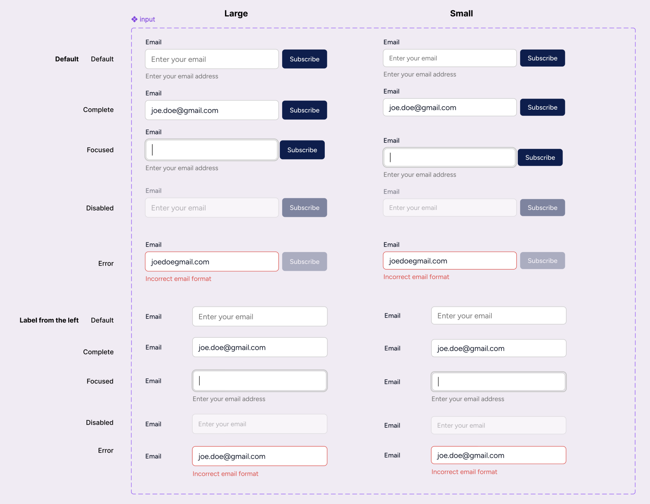
4 variants, 3 sizes, plus hover / focus / disabled. Variants map to tokens, so a rebrand never touches component code.
Input / Form field
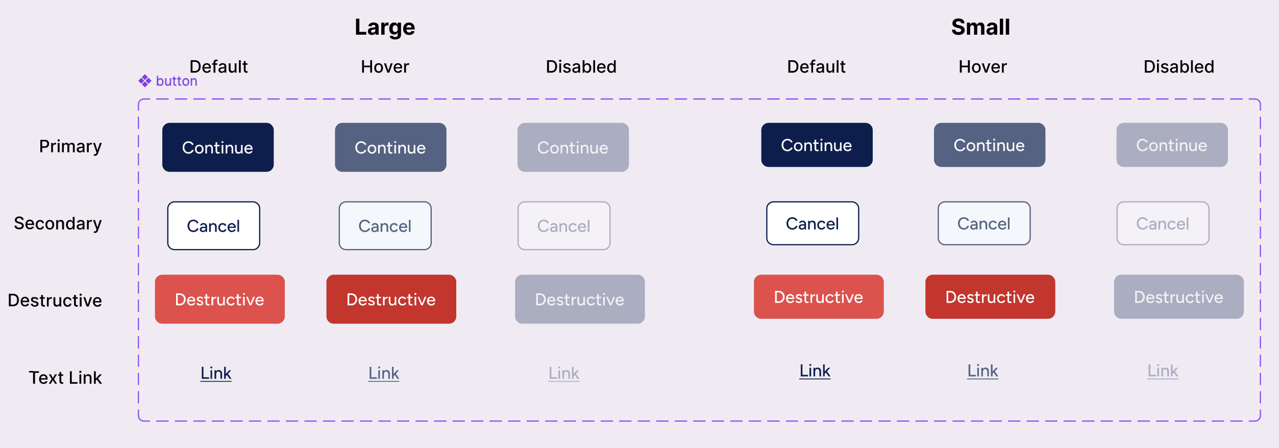
Label, control, helper text, and an error state.
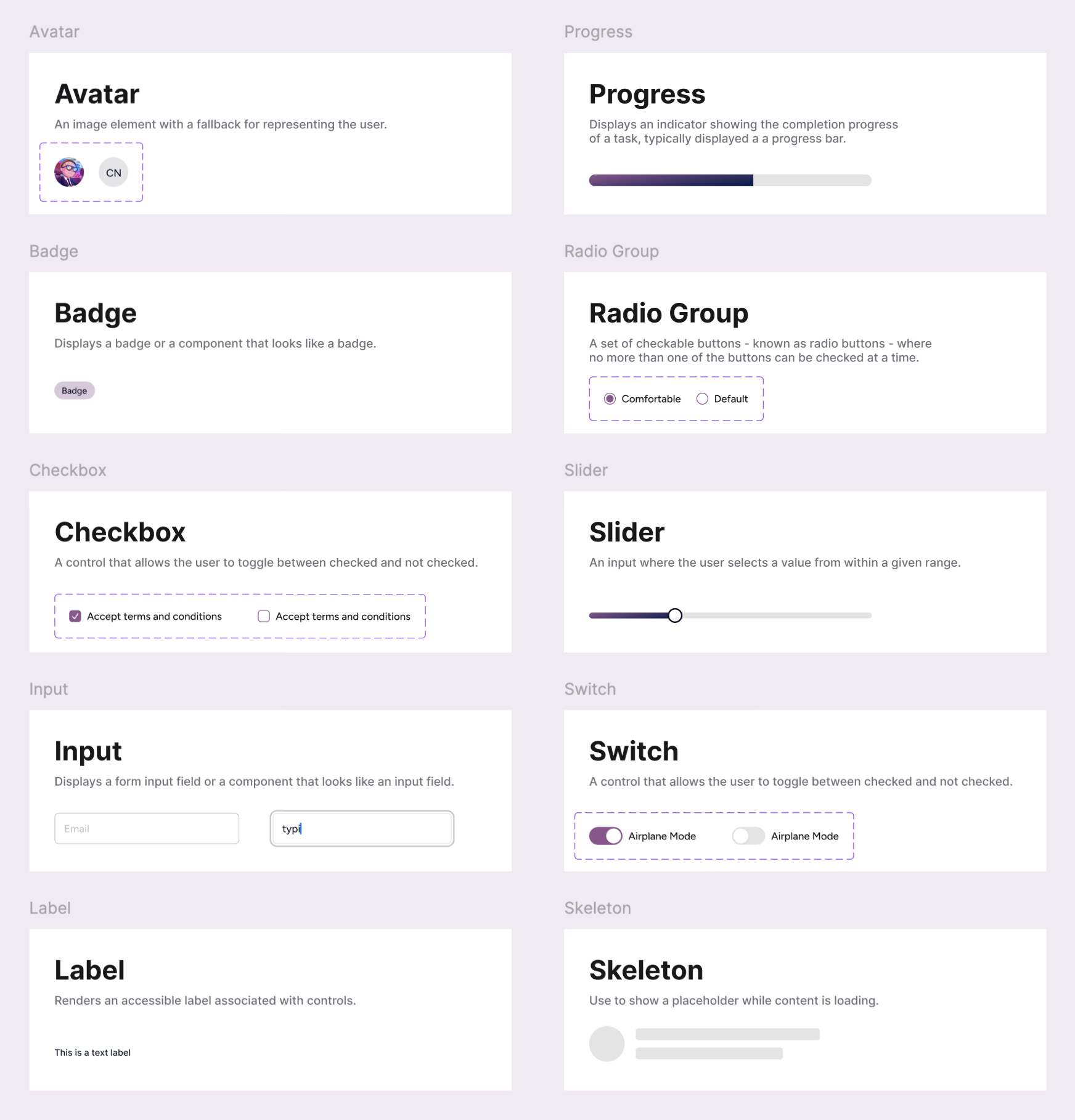
Card, Tabs, Badges
Smaller primitives assembling into a bigger pattern the thing that demonstrates systems thinking.
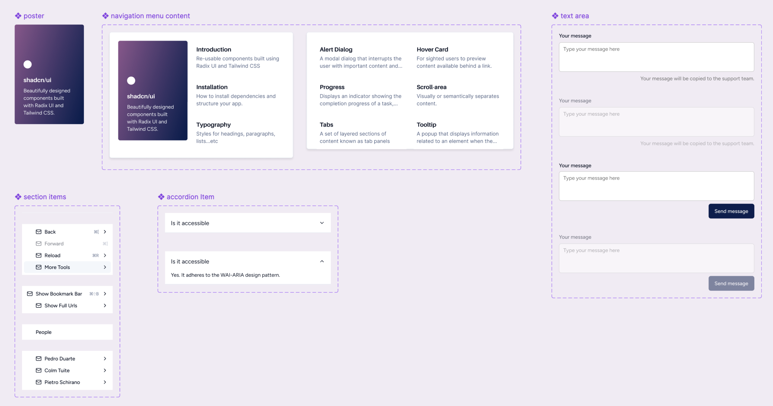
Impact
The design system became the single source of truth across Quilt’s multiple products, so designers and engineers ship consistent, accessible UI without rebuilding basics.